Mariana Lacombe © 2025
Brand & Web by 9 Designs.
For questions please contact management agency on info@9designs.co
Brand Guidelines Overview
Our brand guidelines are designed to ensure consistency and coherence in our branding efforts across all channels and touchpoints. By following these guidelines, our team can maintain the integrity of our brand identity and effectively communicate our values and personality to our audience.
These guidelines cover everything from our logo usage and color palette to our tone of voice and imagery guidelines. They serve as a comprehensive resource for anyone involved in creating content or representing Brandguide in any capacity.
All of the documents below are uploaded in the Master Brand Drive
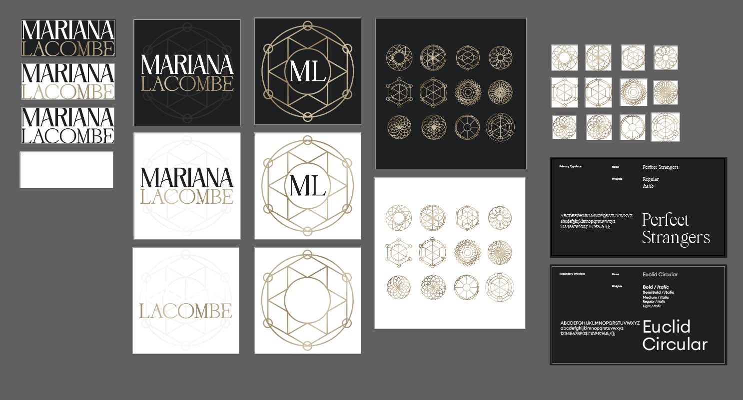
Logo usage
The logo may be used in several ways and it different color variants. The flexibility of the logo system allows for easy usage and impact across all platforms.
Downloads
Logo Usage
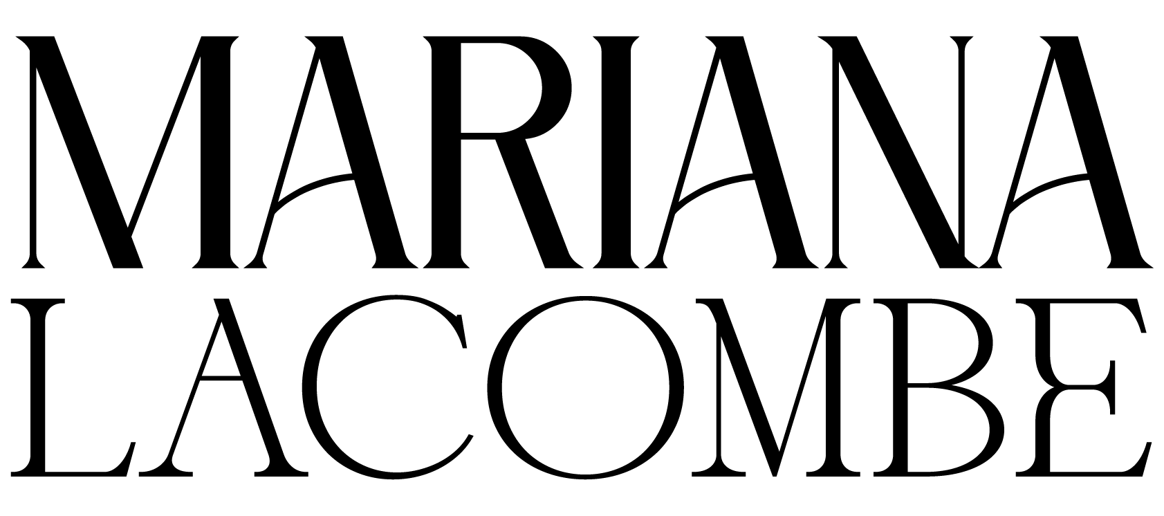
The logo (wordmark) is the primary representation of the Mariana Lacombe brand and should be used across all official communications, including the website, presentations, documents, and external marketing materials. It conveys the full brand name and should be the default mark wherever brand recognition is required.
This is the primary logo to be used on dark backgrounds (as per shown below in the color palette – on Eclipse Black).
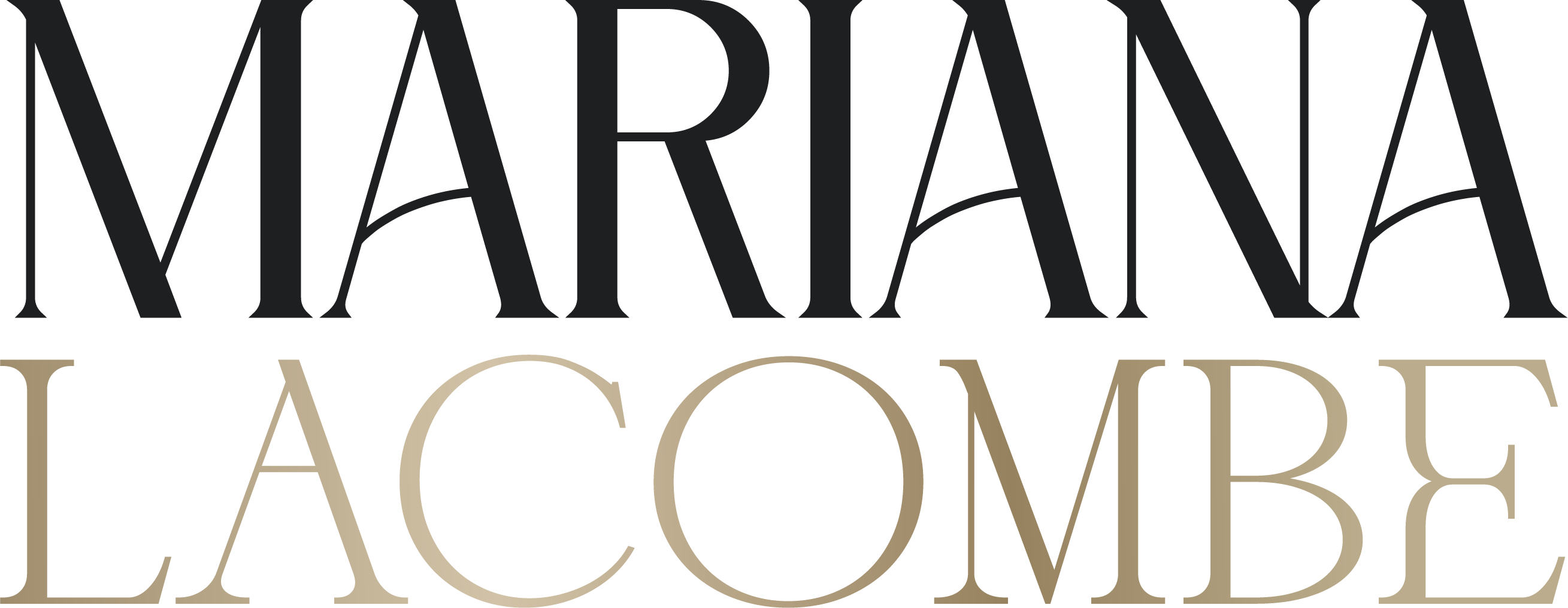
This is the secondary color logo to be used on light backgrounds (as per shown below in the color palette – on Soft Linen).
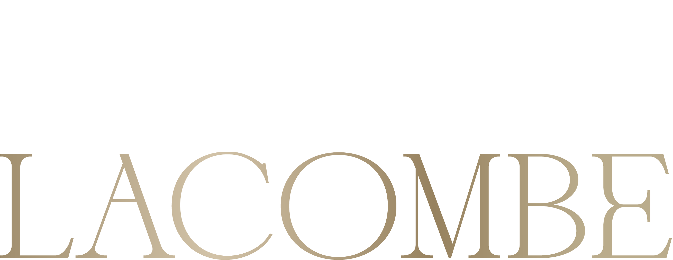
This is the full black logo to be used on light backgrounds (as per shown below in the color palette – Eclipse Black).
Purpose: The full black logo is intended for high-contrast applications where simplicity and clarity are essential. It works best in monochrome documents, one-color printing, stationery, or where brand recognition is needed without the use of accent colors.

This is the full white logo to be used on dark backgrounds (as per shown below in the color palette – Soft Linen).
Purpose: The full white logo is designed for reversed applications where the logo needs to stand out clearly on dark or colored backgrounds. It should be used for overlays, digital media, or minimalistic layouts where color contrast ensures maximum legibility.
Brandmark Usage
The brandmark (symbol with ML) is a supporting element designed for flexible use. It can be applied in places where the full logo may not be practical, such as social media profile images, icons, watermarks, merchandise, or subtle brand accents. While it reflects the same identity, it should always be used in complement to the primary logo rather than as a replacement.
Primary
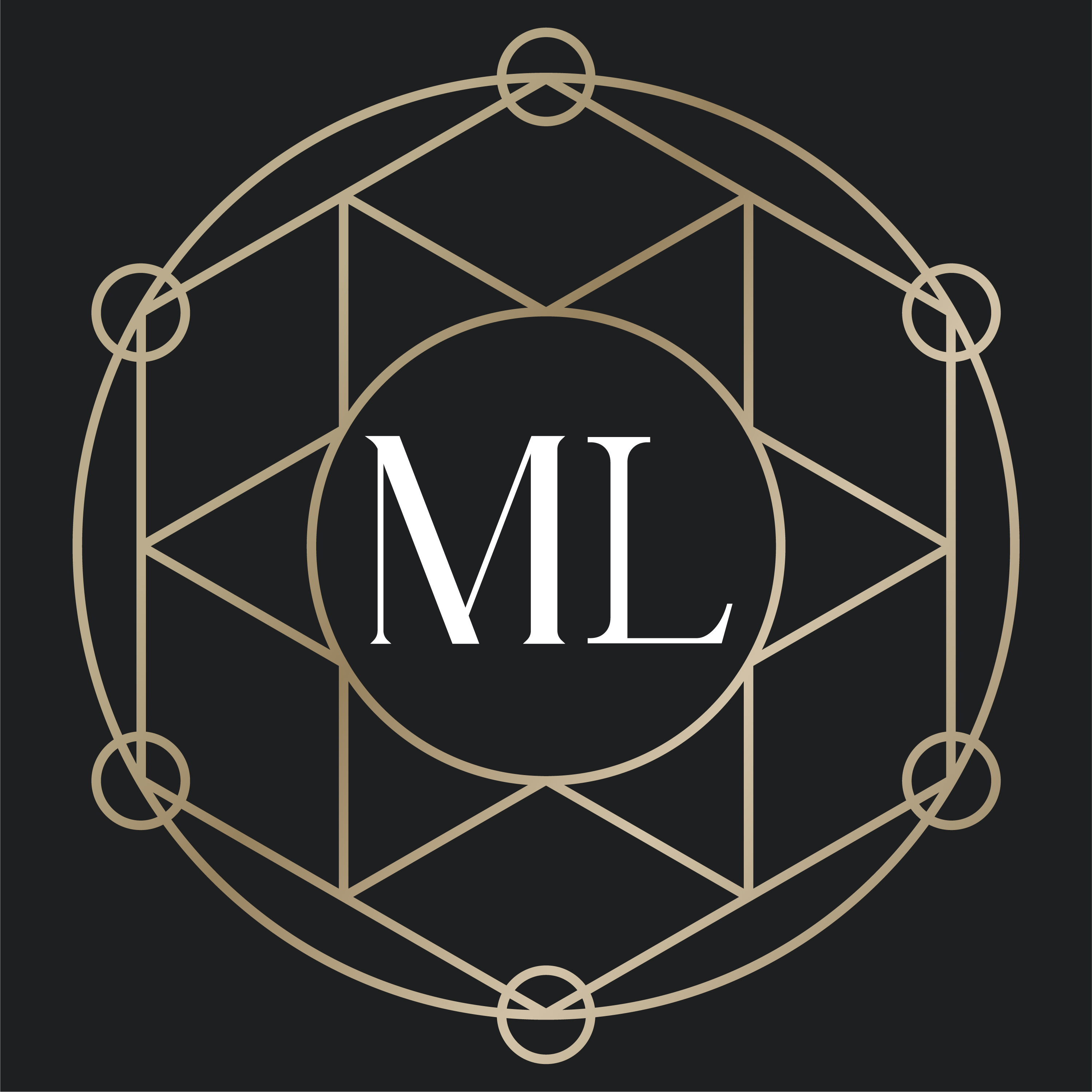
This is the primary brandmark to be used on dark backgrounds (as per shown below in the color palette – Eclipse Black with Olive Bronze).
Dark

This is the secondary color brandmark to be used on light backgrounds (as per shown below in the color palette – Soft Linen with Olive Bronze).
Typography
Typography is one of the cornerstones of our visual identity. A good pairing of fonts and a strong hierarchy ensure maximal visual impact. Beneath you will find information about the typefaces we use.
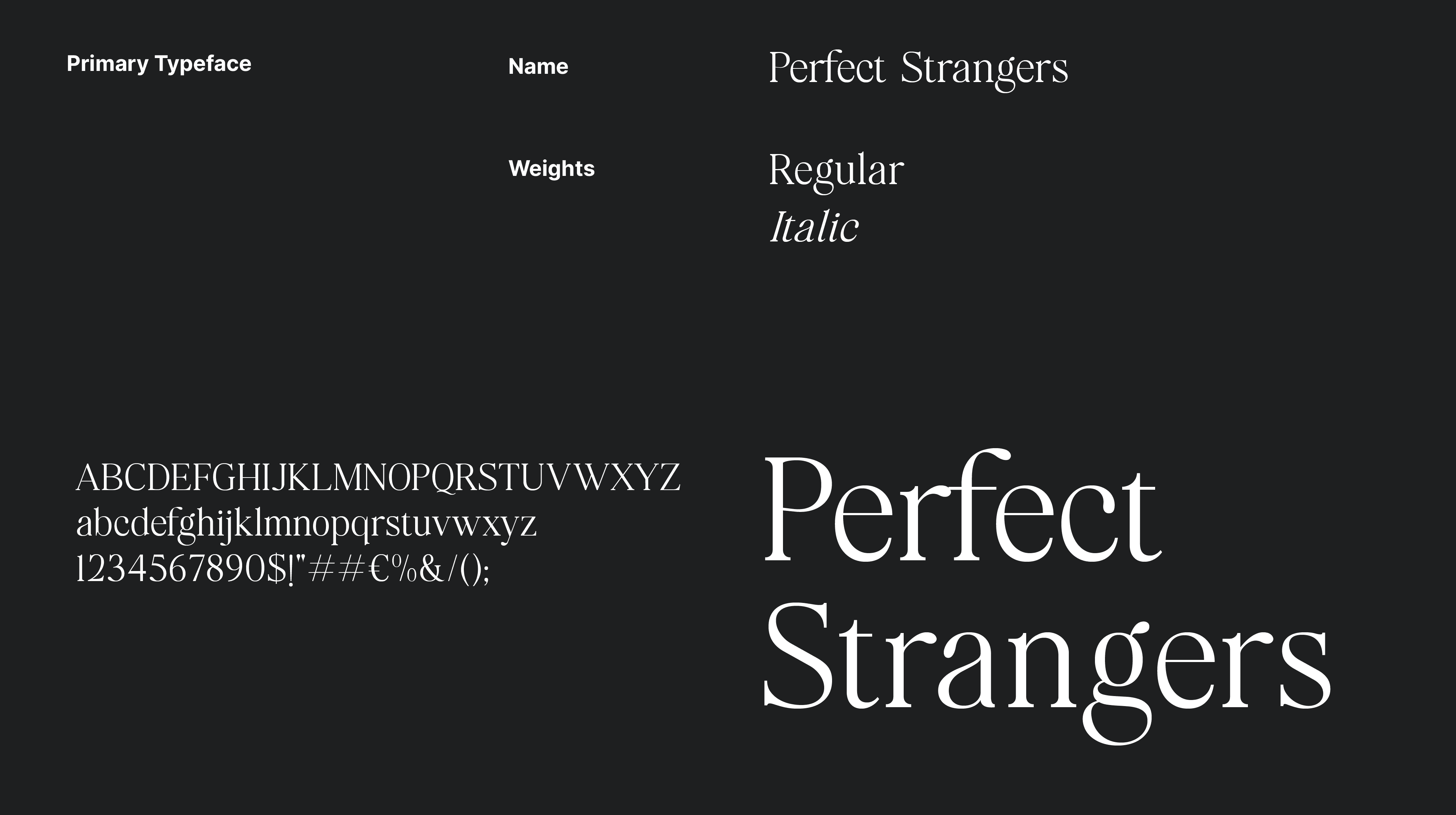
Primary Typeface
Perfect Strangers
A refined, elegant display serif with a distinctively luxurious and graceful flair. Designed for visual impact, it's ideal for headlines, logo treatments, and instances where the brand needs to exude sophistication and presence.
Secondary Typeface
Euclid Circular A
A modern geometric sans-serif with impeccably rounded counters and clean, horizontal terminus detailing. Its mathematically inspired structure offers clarity, versatility, and a timeless aesthetic. Available in multiple weights, it excels in body text, digital interfaces, subheadings, and long-form copy, delivering both readability and subtle character.
.png)
Colors
The colors are another essential part of of our visual identity across all platforms. In the following section you will find the primary colors as well as an extended palleted to be used for web.
Primary Colors
The primary color palette consists of 3 supporting colors and one brand color. These colors are used in our logos, on flyers and on social media etc.
Gradient Colors
The gradient palette is built from a combination of one core brand color and four supporting tones, creating a sophisticated metallic-inspired effect. These colors work together to bring depth, warmth, and elegance to the brand identity. The gradient is primarily used in logos, digital assets, print materials, and social media graphics where a premium finish is required.
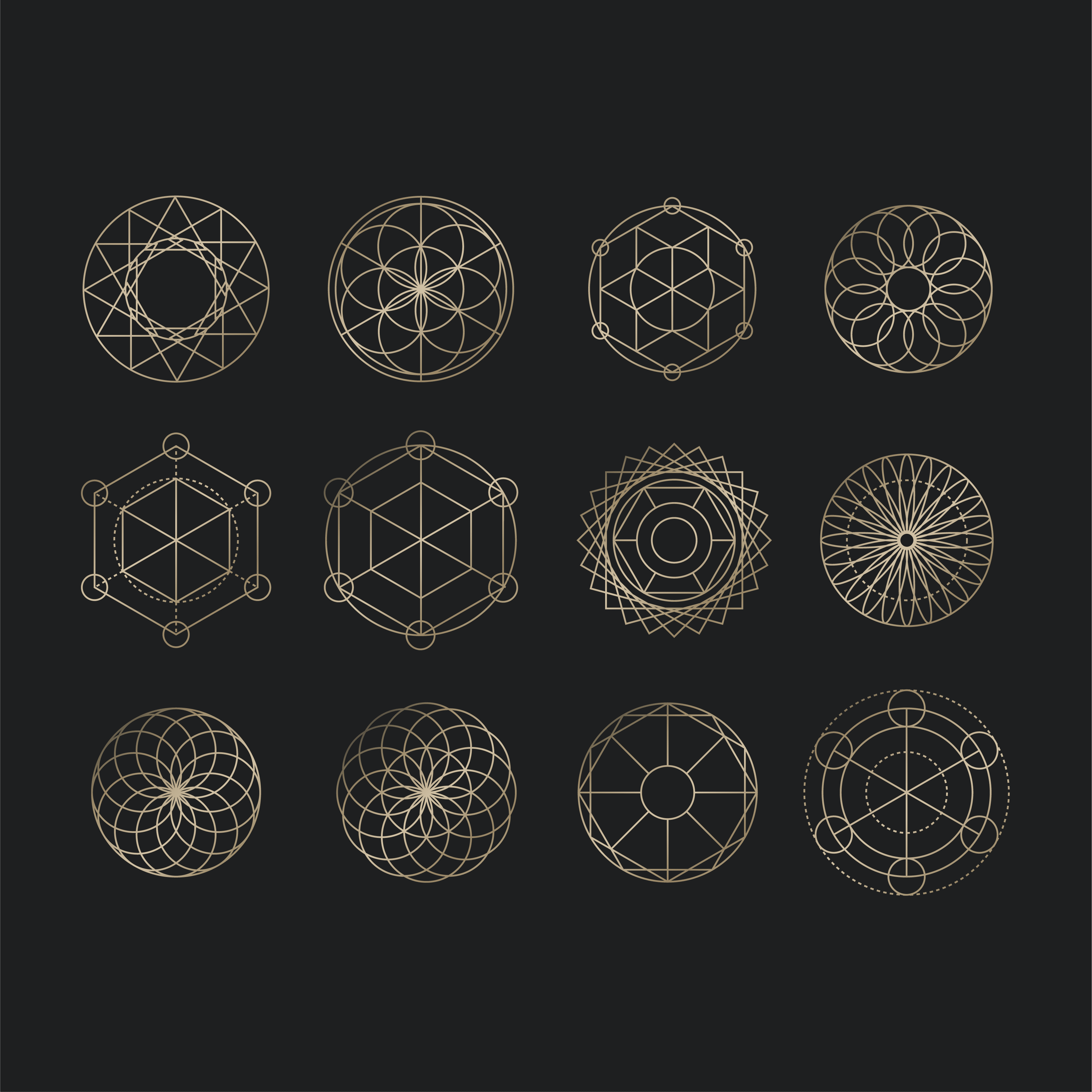
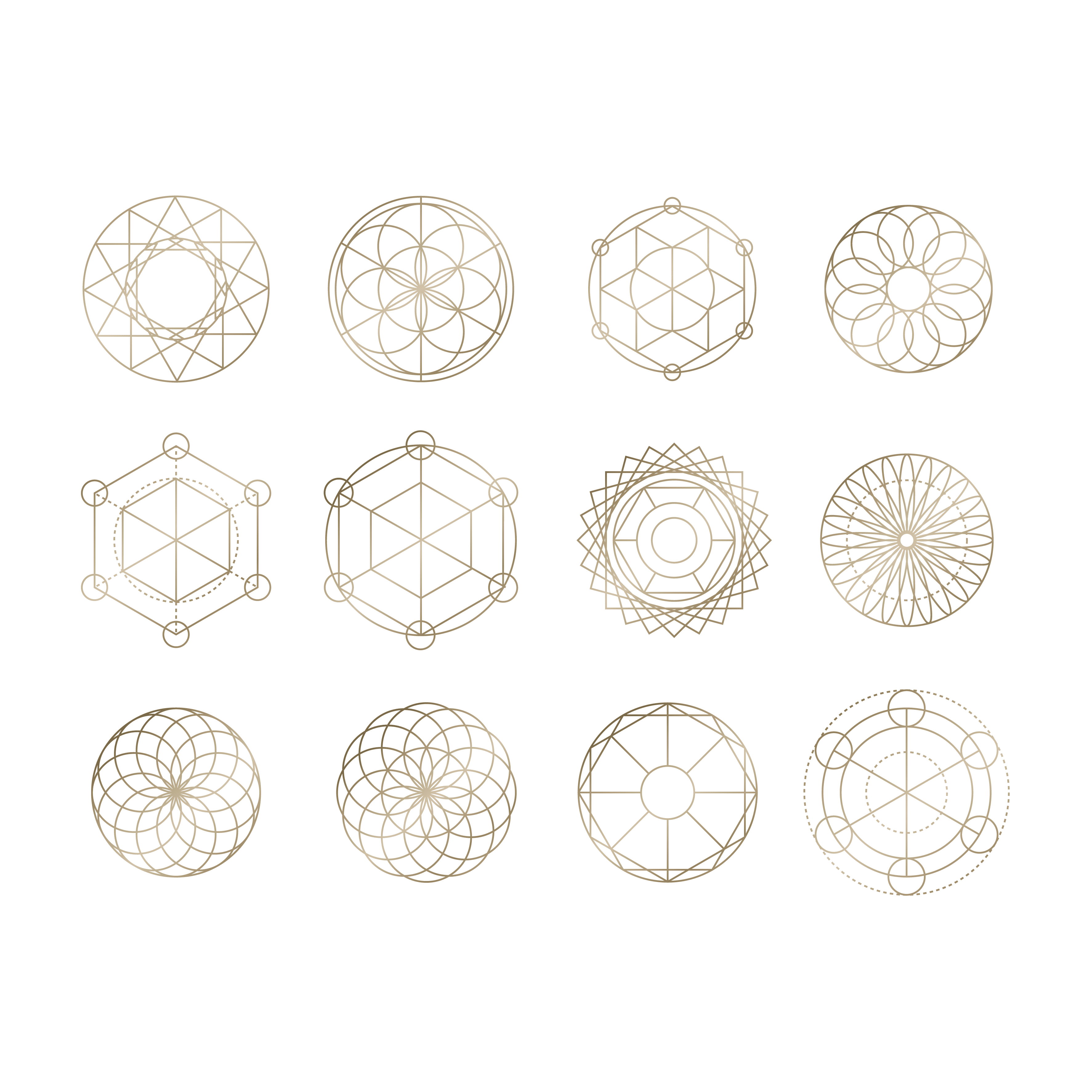
Icons
Our brand icon set is a collection of geometric symbols that support and extend the visual identity. Inspired by sacred geometry and balance, these icons bring structure, elegance, and a sense of depth to the brand. They are always presented in outline form and applied in the official brand colors to ensure consistency across all touchpoints.
Dark Version
The dark version of the icons should be used on darker background colors from the brand palette (e.g., Eclipse Black). This ensures clarity, contrast, and a premium finish in digital and print applications.
Light Version
The light version of the icons should be used on lighter background colors from the brand palette (e.g., Soft Linen). This ensures readability and balance while maintaining the brand’s elegant style.
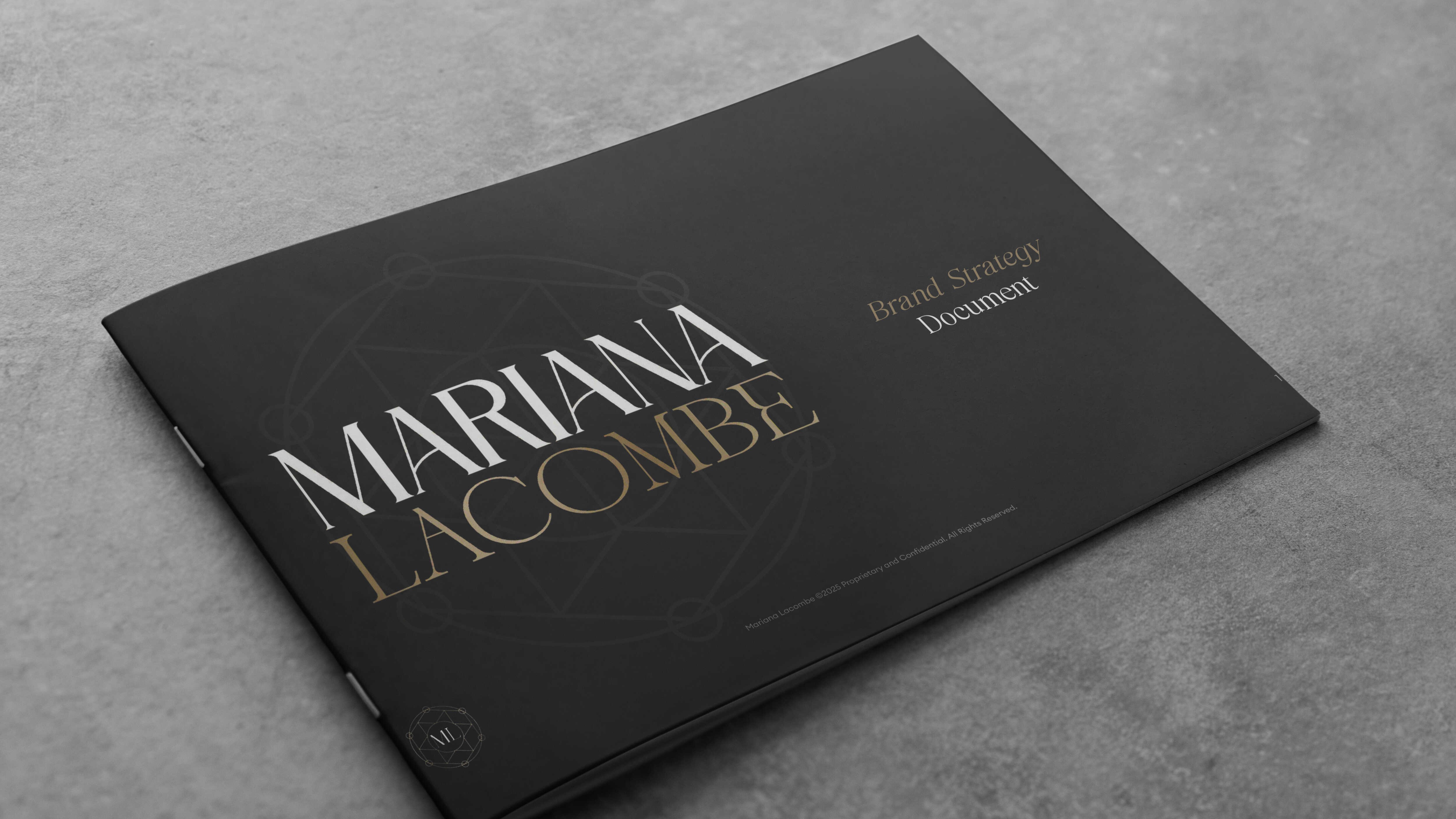
Brand Documents
In this section you will find several different brand documents which are to be used for strategic guidance for the brand
Brand Imagery
In this section you will find images that can be used across marketing, promotions and any Mariana Lacombe related content for brand representation